

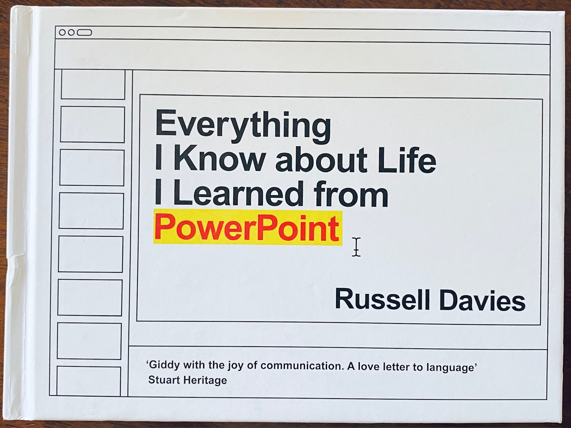
I bought this book because I was intrigued by the title and shape in the aspect ratio of a slide. Russell Davies recounts his career in advertising and UK government, and what he has learned "from thirty years of PowerPoint and how to communicate, be creative and not get too scared". He notes the principles in this book equally apply to other presentation software - Google Slides, Apple Keynote and Libre Office.
PowerPoint was created by Robert Gaskin between 1987 and 1992 in a company named Forethought. The first version was released in 1987 on Mac and in 1990 a Windows version became available.
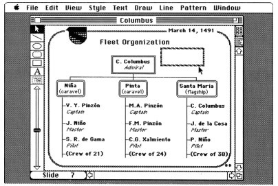
Microsoft acquired the product in 1992 and bundled it in the Office suite of products. You can read about the early history of the product, the technology, business and people in Robert Gaskin's book Sweating Bullets which is freely available as a PDF and linked at the end of this article.
PowerPoint is now used in so many places and events: birthdays, weddings, funerals, sales presentations, classrooms and Zoom meetings. You can include pictures, videos and sounds so it is a great tool for making digital scrapbooks.
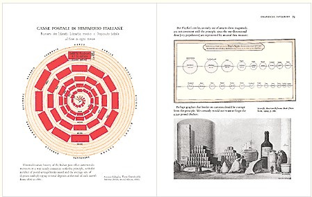
Davies was fortunate to attend a one day seminar by Edward Tufte, who has written three magnificent books on presenting information and visual explanations. I own these Tufte books: The Visual Display of Quantitative Information (1983), Envisioning Information (1990), and Visual Explanations (1997).
Now that PowerPoint is readily available, it has been used and abused in the business world as well as primary schools and high schools. Poorly created PowerPoints have created the experience of Death by PowerPoint where the audience is bored senseless with long lists of bullet points, and graphics that don't make sense.
Next he discusses some bizarre and confusing graphics with the award for the most cryptic slide going to the following slide which supposedly explained the situation in Afghanistan. General Stanley McChrystal, the US and NATO force commander, remarked 'When we understand that slide, we'll have won the war'. The fact that US and NATO forces left Afghanistan to the Taliban is maybe proof of this slide’s obscurity.
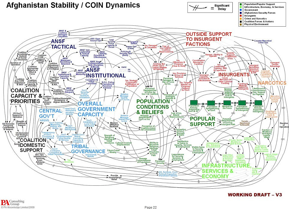
I saw some shockingly complex slides when I worked for a software company. Often the presenter would say "You probably cant read this" or "sorry the type is so small" which begged the question SO WHY DID YOU MAKE THIS SLIDE?
You may have heard that Jeff Bezos of Amazon banned PowerPoints in meetings. His reasoning was that deep thinking and detailed work was required instead of a flashy PowerPoint presentation. Now the work is summarised in a document and shared with others for discussion. The unnecessary time and attention preparing a presentation distracted workers from the real work. I also recommend you look at Nancy Duarte’s web site and read about Slidedocs - a highly readable form of business communication.
Some guidelines on making PowerPoints
The most important thing to remember is that PowerPoint is a visual aid to support your presentation. Preparing a presentation is not preparing a PowerPoint file, it is thinking what you have to say and structuring your story. Then you can think about what slides you need.
Davies has some advice:
Divide the presentation into three parts. This is similar to the three act structure of a book or film.
Tell a story - your presentation is a story with a beginning, middle and end.
Make your words short, big and clear (easy to read from the back of the room)
Make your pictures relevant, big and clear
Don't have many colours.
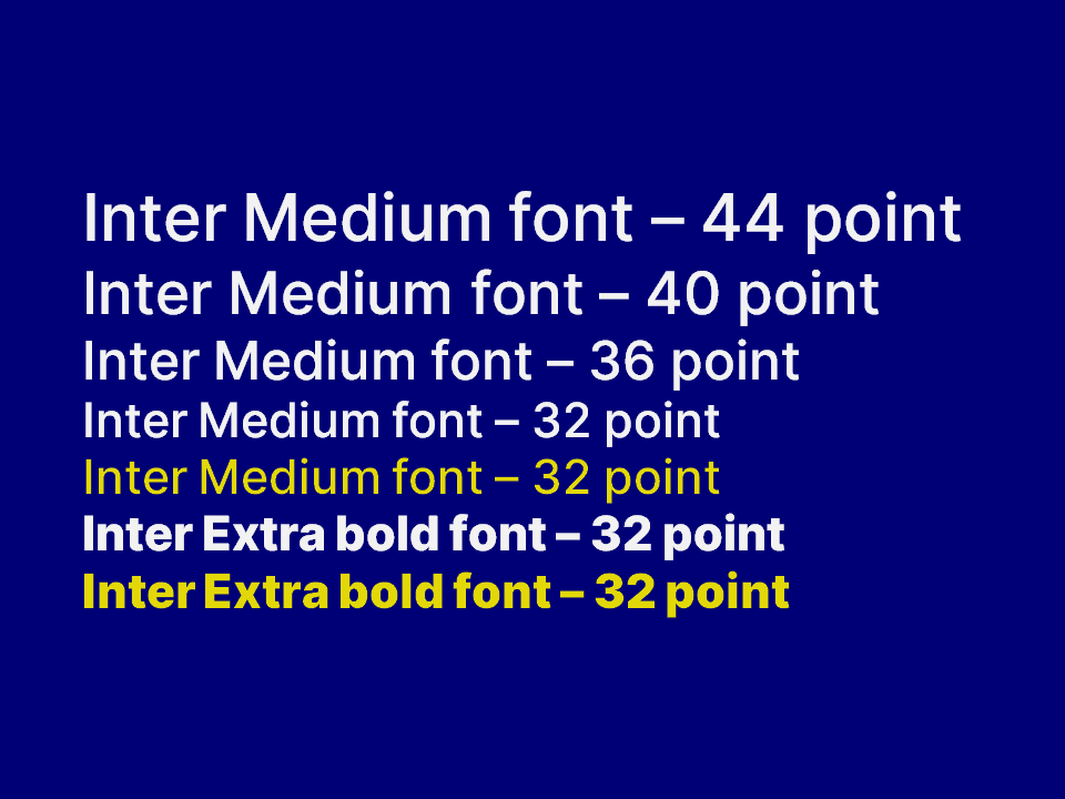
Darker backgrounds are better and easier on the eyes. Try using a dark blue background with white text.
Don't have many fonts. The Open source font Inter is recommended.
Practice a lot. Practice early, practice often.
Be yourself.
Don't use headings on your slide.
Think of your presentation as a series of posters, each one visually striking, memorable and arresting.
Keep it short. No more than 20 minutes.
When preparing your presentation ask yourself what are the two or three most striking and interesting things you are going to say.
Keep the presentation short, tight and have a point. Make sure the audience understands the essence of your talk.
Plan your presentation on paper, preferably index cards or post-it notes and a Sharpie pen.
Focus on your presentation and the story you are telling. The PowerPoint is there to support your storytelling.
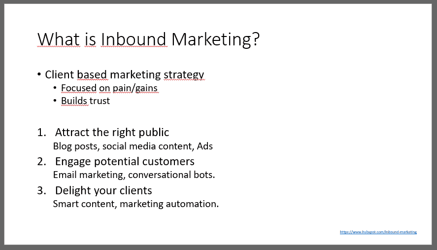
Here is a slide made with the recommended dark blue background, white text and yellow highlighting. The font is Inter.
Advice in a nutshell
What is the purpose of your presentation?
What do you want the audience to know, think, feel or do after hearing your presentation?
What is the job of the PowerPoint you will use in your presentation?
Make sure the PowerPoint does it job to support your presentation.
Other Useful Web sites
Russell Davies website about the book. Includes link to Sweating Bullets by Robert Gaskin
Over to you ….
Do you make presentations? How do you feel about PowerPoint?
What is the most boring presentation you have ever attended?
Ah, yes, Mr BB and his micro-font PowerPoint Agile presentations you and I used to "enjoy". At least we got squinting exercise with ouir eyelids! ;0) Can't recall which was most annoying though: Agile itself or Agile with 4 pt font! :0(